Painting Workflow - The Cowboys
This post takes a deep dive on a painting by Juan Ramirez to explore considerations for artists to keep in mind when approaching a piece, share practical digital art techniques and some insights on choosing brushes and tools.
Learn about:
Point of interest
Composition & depth
Painting & Colors
Brush and stroke tips
Layer tips for texturing and color adjustments
Establish your main focus
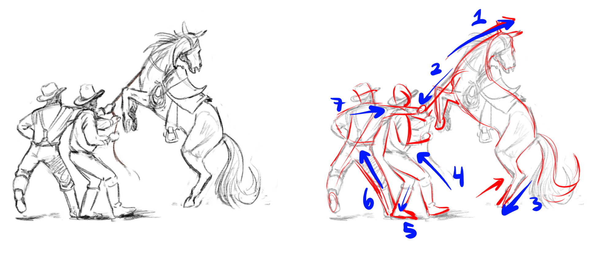
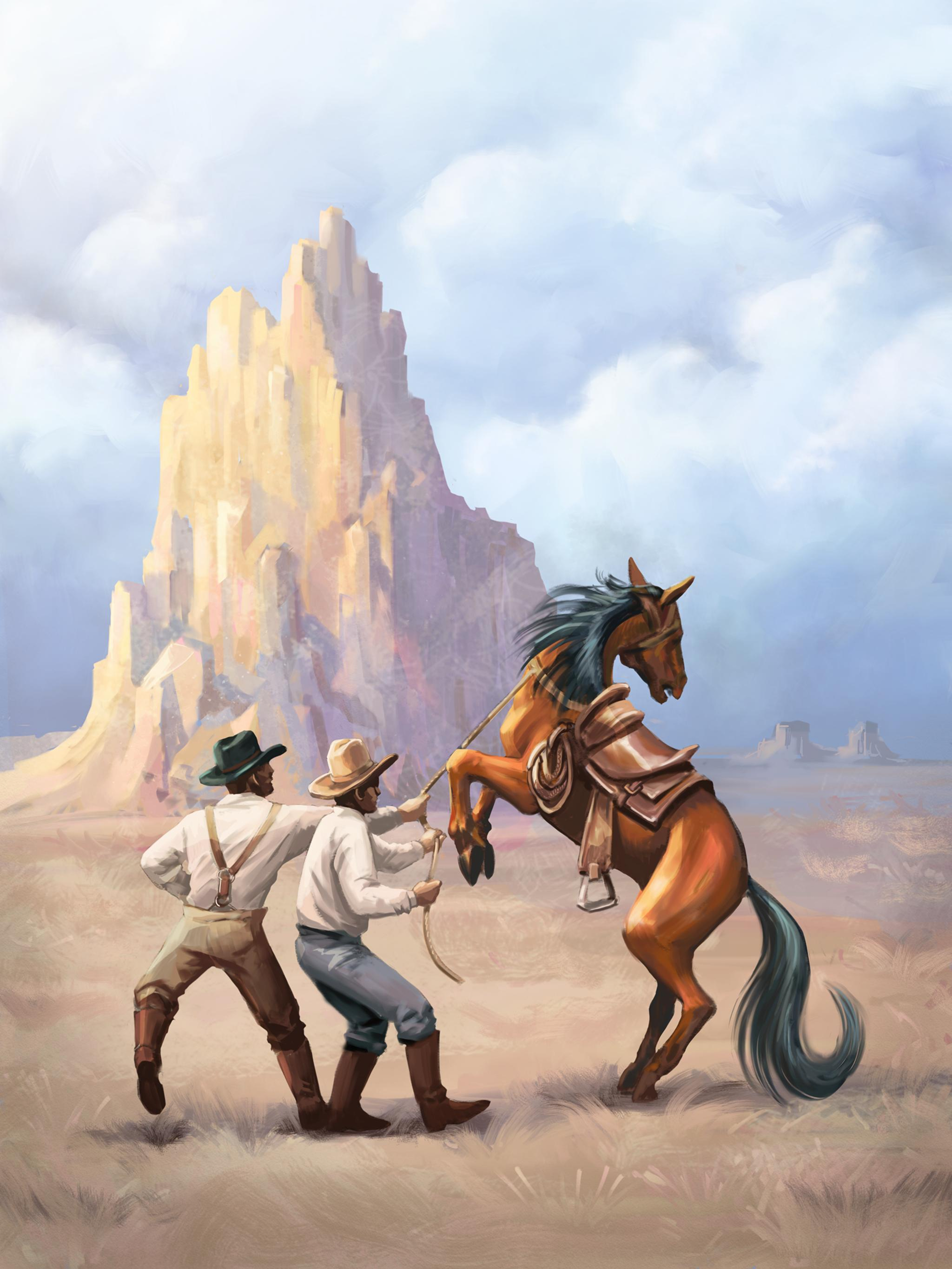
Juan’s sample painting is a classic Western theme. The point of interest is a dynamic scene between two cowboys and a horse.
To capture the action, the initial sketch was drawn following the tension. The pencil strokes were made in the direction of the lines of action to reinforce the energy and flow of the poses.
Composition
This composition was made applying the rule of thirds to create eye flow and draw focus to the main subjects in the painting.
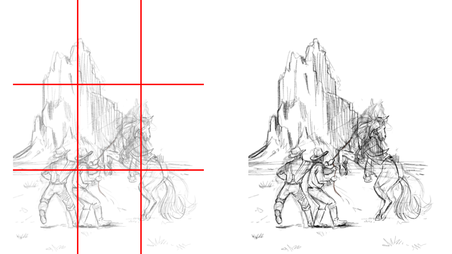
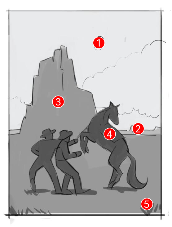
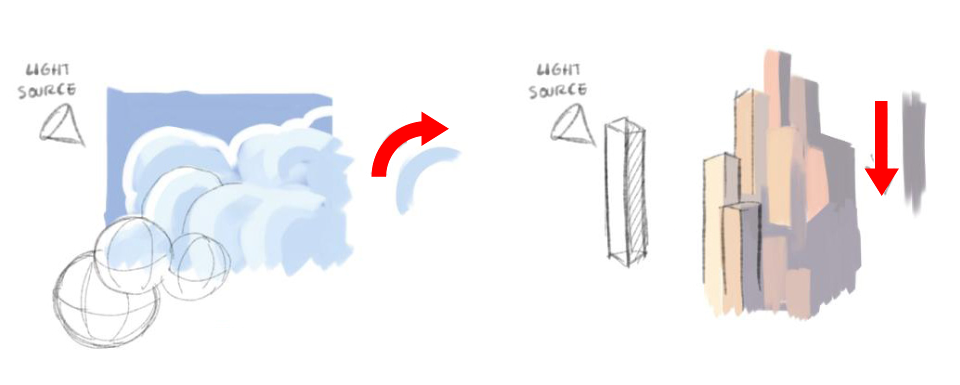
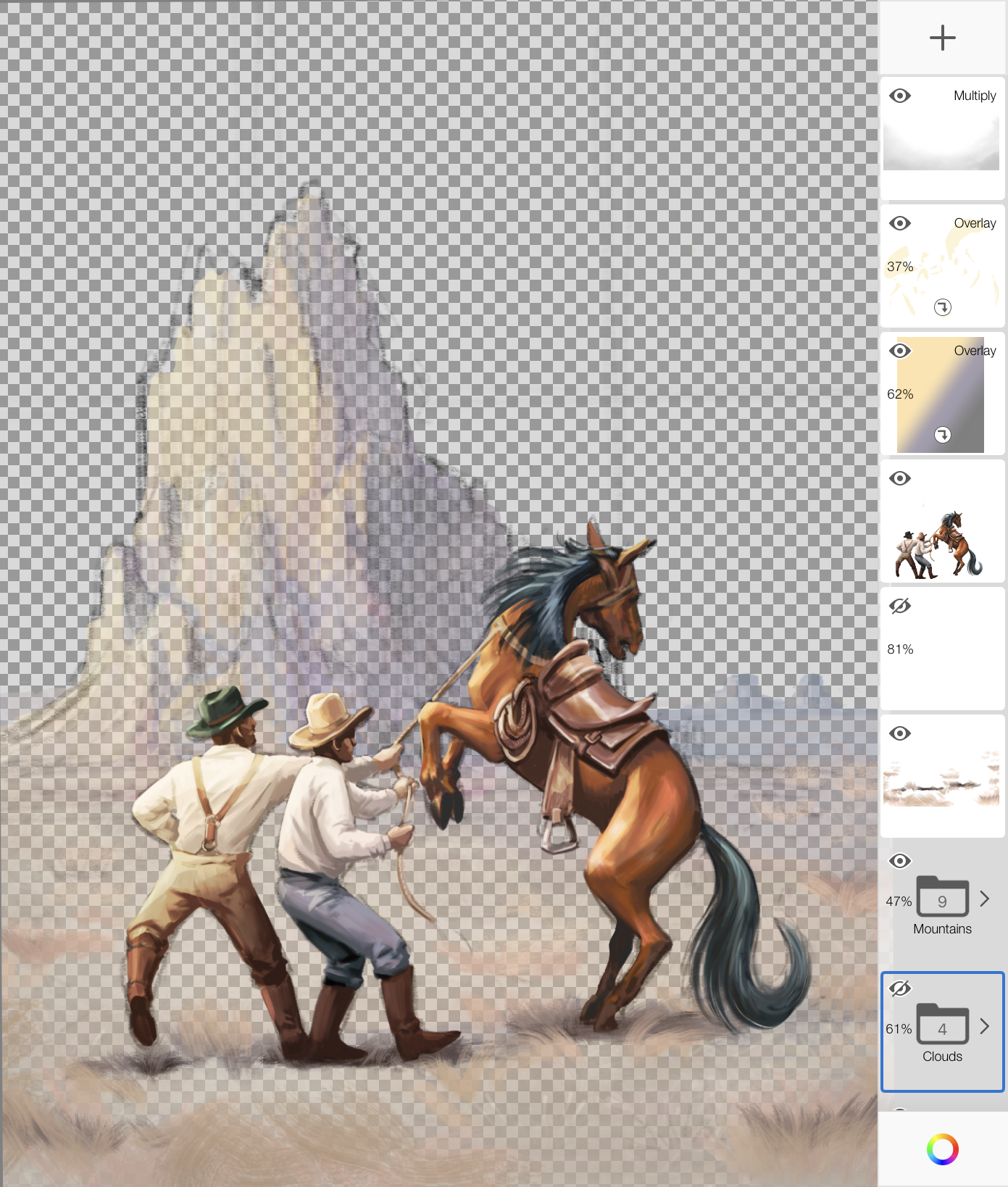
Be aware of where all the key elements are relative to each other in the scene. You can think of these as zones.
These zones not only define what is in the foreground, mid ground and background, but they also influence how you paint.
Use bigger, softer brushes on your backgrounds.
Use smaller, tighter brushes for mid ground to create clarity around your main focal point.
For foreground elements, go back to softer, blurrier brushes to create more depth.
Zone 1: the sky and clouds in far distance (background)
Zone 2: the horizon (background)
Zone 3: the mountain (mid ground)
Zone 4: the main subjects (mid ground)
Zone 5: grass/shrubs (foreground)
Colors
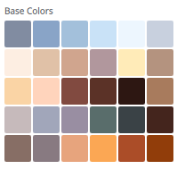
Come up with a color palette before you start painting. You don’t need to pre-define every color you think you might use, but identifying your key colors will set the tone and you will be able to adjust and add colors as the piece develops.
You can draw inspiration from photos or other reference artwork. In Sketchbook, you can import images to sample colors or build out a custom color set by dragging and dropping swatches into a palette.
If you have Sketchbook Pro or Sketchbook and the Premium Bundle, you can import an image into the Image tab and automatically extract color palettes.
You can download and try the color palette that was used for this sample painting here: Western.skcolors
Painting Tips
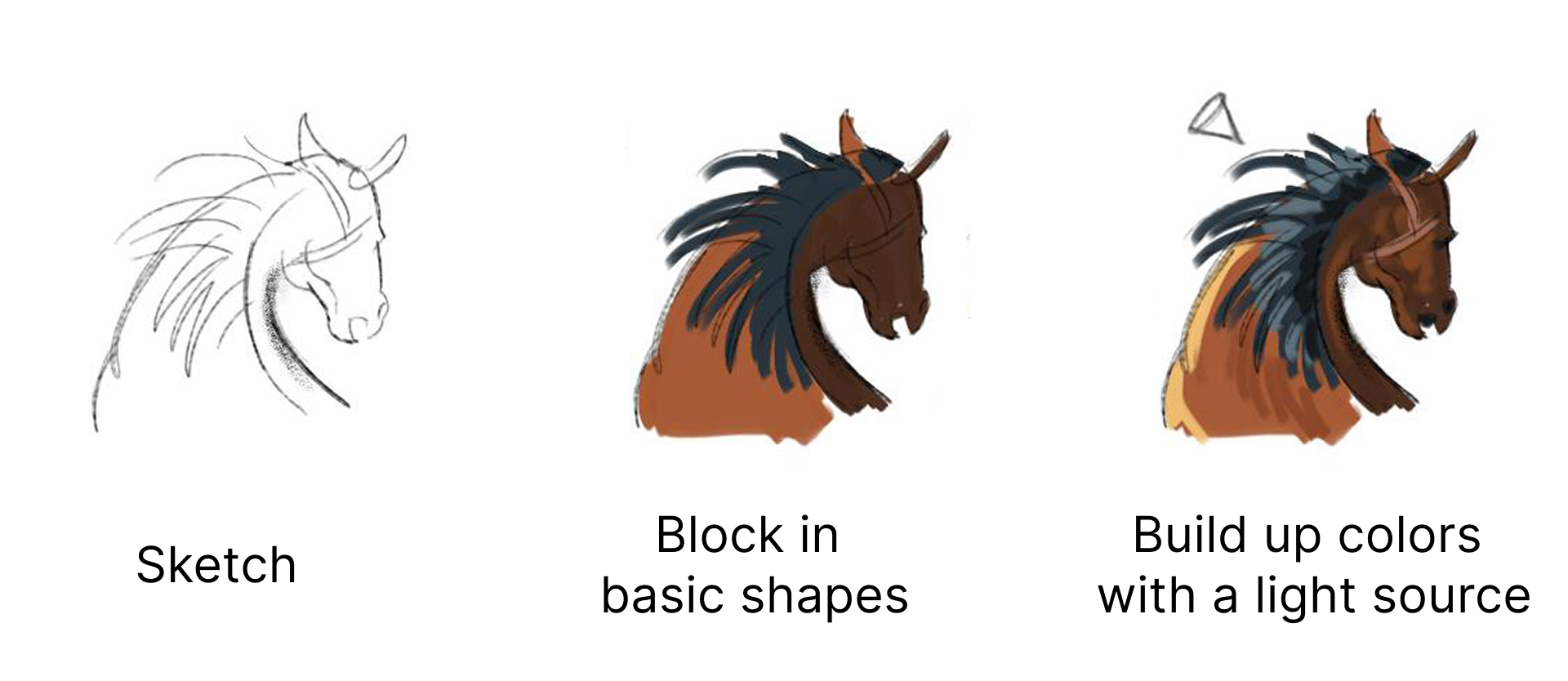
Block in the main shapes from your sketch with the base colors to establish the values.
Start with bigger brushes and move to small brush sizes to capture more details
Remember to determine the light sources in your scene, as that will help build your painting and choice of colors to ensure highlights and shadows are consistent.
Turning on Randomize Color and applying a slight Hue variation (setting at 5-10) is a way to add more richness as you build up brush strokes.
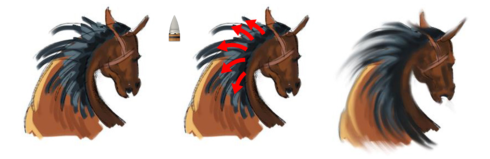
Stroke direction contributes a lot to how your paint will appear. Similar to following the lines of action for the initial sketch, you can apply your paint strokes in the same deliberate way.
Direction can be even more important for certain brush types that have blending or fall-off behavior.
Blending strokes
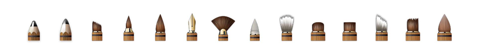
Brushes from the Artist set were used in this painting to achieve the style. This set is available in the Brush Library in all versions of Sketchbook. It features a variety of brush types that are ready to use, but also serves as a great starting point for customizing.
There are 3 brush types that are ideal for producing blended strokes:

Smudge
A colorless brush type that softly blends the paint on a layer. The strength value in the Basic settings defines the drop-off of the effect. The Blending Brush in the Artist set is a Smudge brush. The Brush Library also includes an entire set of Smudge brushes.

Synthetic Paint
Starts with the active color and gradually fades, simulating paint being used up. This brush type will also smear other paint as the stroke passes over. The strength value defines how quickly the paint fades. The Brush Library also includes a dedicated set of Synthetic Brushes you can experiment with.
Natural Blend
A versatile brush type that can create a variety of brush effects by adjusting the Blending, Persistence, and Dilution sliders in the Basic settings. Good for brushes that pick up hints of color along a stroke. The brush pictured here is the Bleeding Watercolor brush in the Artist set.
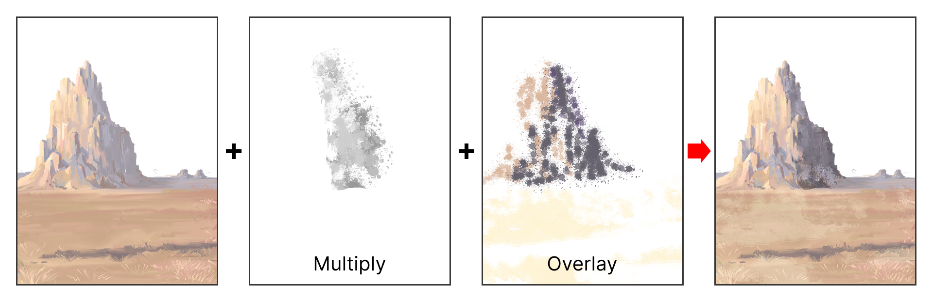
Adding Texture
Create new layers to add texture to your work.
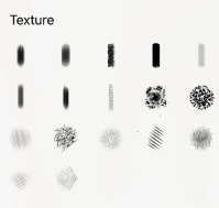
You can use the Texture set in the Brush Library or create your own textures.
Combine Blend Modes and Clipping Masks and adjust layer Opacity to experiment with the effects.
Final touches
Blend modes can be exploited to further accentuate the mood.
Solid paint on layers and Linear Fills can be used to fine tune colors in specific areas or globally across the entire canvas.
Airbrushes can be used to paint soft vignettes to further control the focus in the painting.
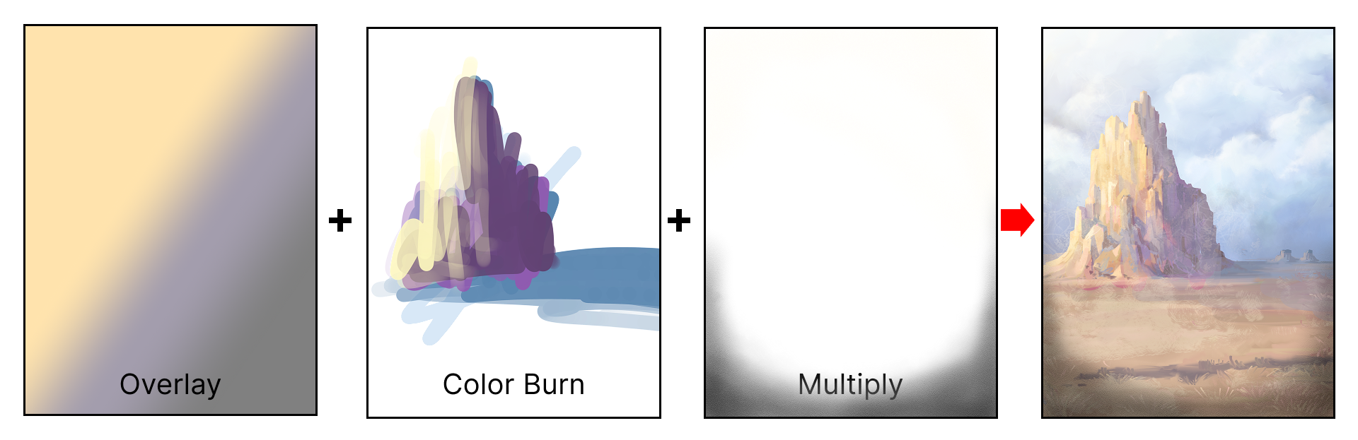
Below is the final painting with all the final touches applied.
Hopefully this walk-through demonstrated simple and effective ways for you to get a hand-painted feel and personality into your artwork.
You can further inspect the layers used in this painting by downloading the SAMPLE TIFF (1200×1600 with 26 Layers/Groups).
Special thanks to Juan Ramirez for sharing his techniques and artwork.