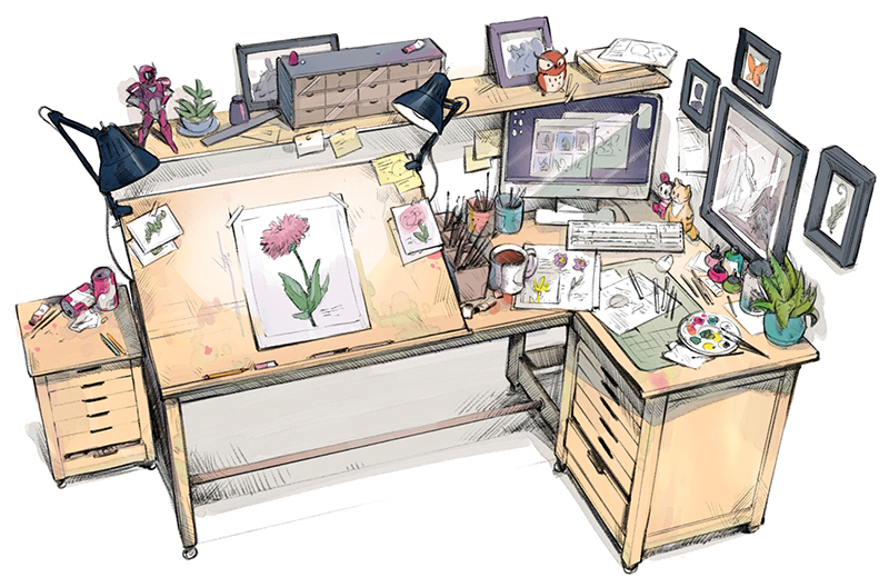
The art of ideas
You never know when a great idea will spark, or where it will lead.
From quick sketches to fully finished artwork, Sketchbook® goes where your creativity takes you.
Sketchbook Pro - for macOS and Windows


Sketchbook - for Android and iOS


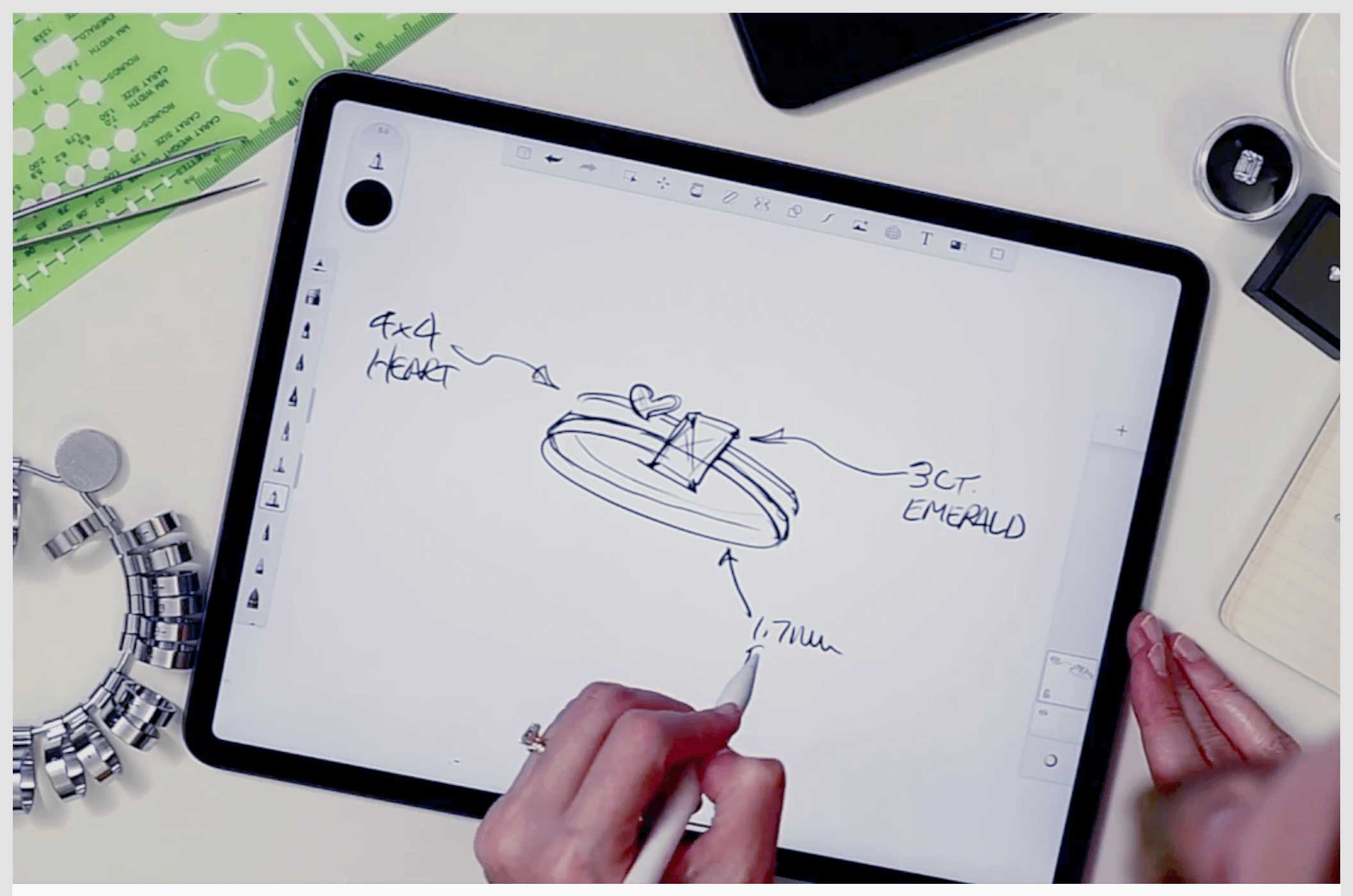
Draw, naturally
Working in Sketchbook feels like drawing on paper. Brushes and pens behave like their physical counterparts (without cluttering up your desk or going dry). The interface is clean and unobtrusive, you can also tuck tools and palettes out of sight until you need them and focus on drawing.
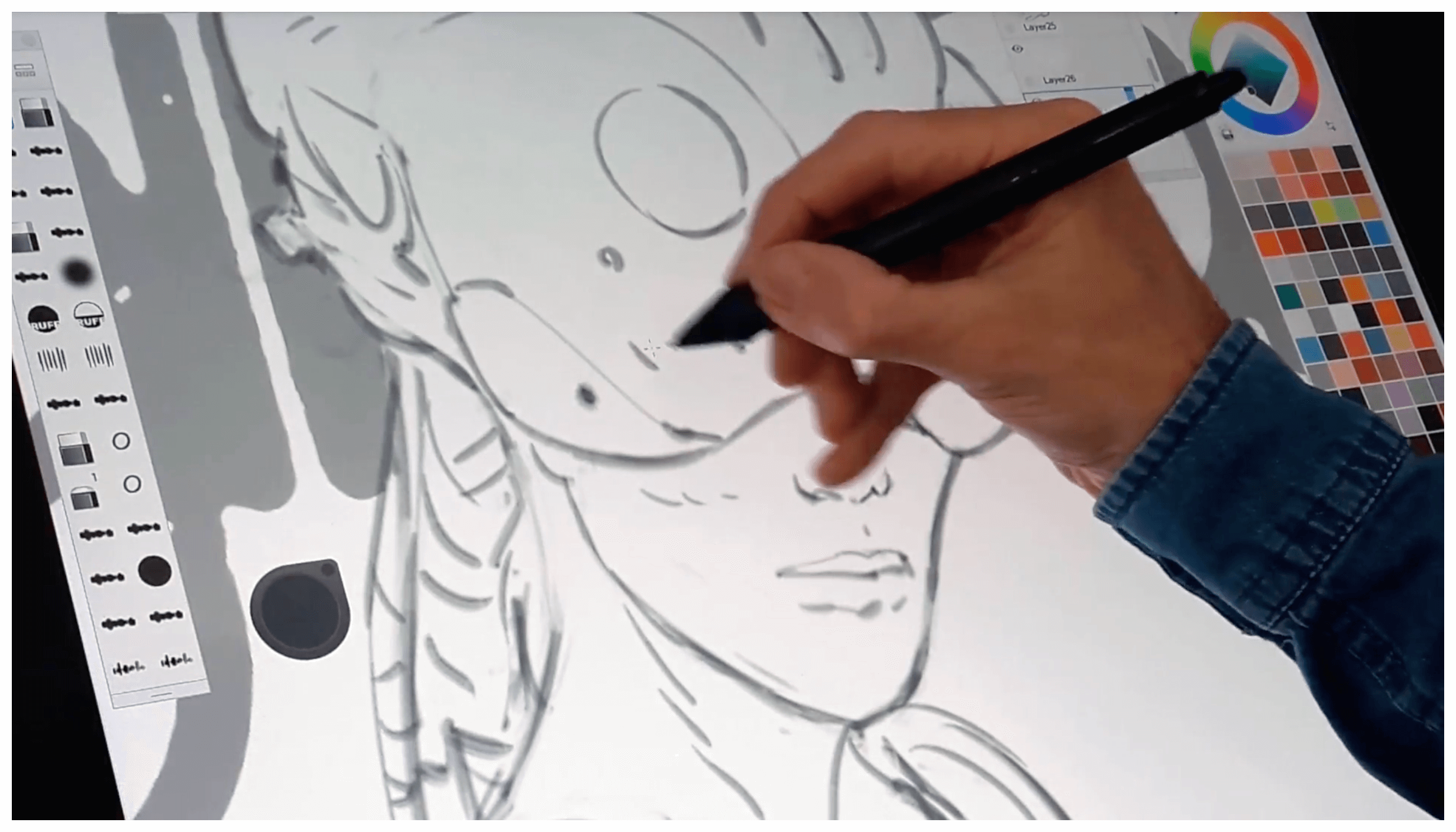
Every tool at your fingertips
Sketchbook has all the features you expect from a professional-grade app. A wide variety of highly customizable brushes supported by guides, rulers and stroke tools give you both stylistic freedom and precision when you need it. Layers with a full complement of blend modes deliver the flexibility to build up and explore drawings and color.